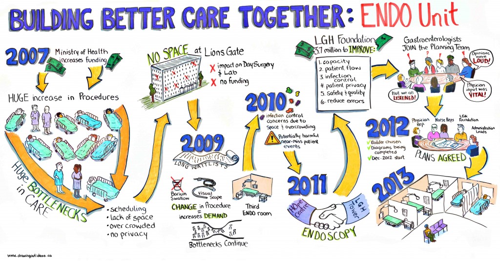
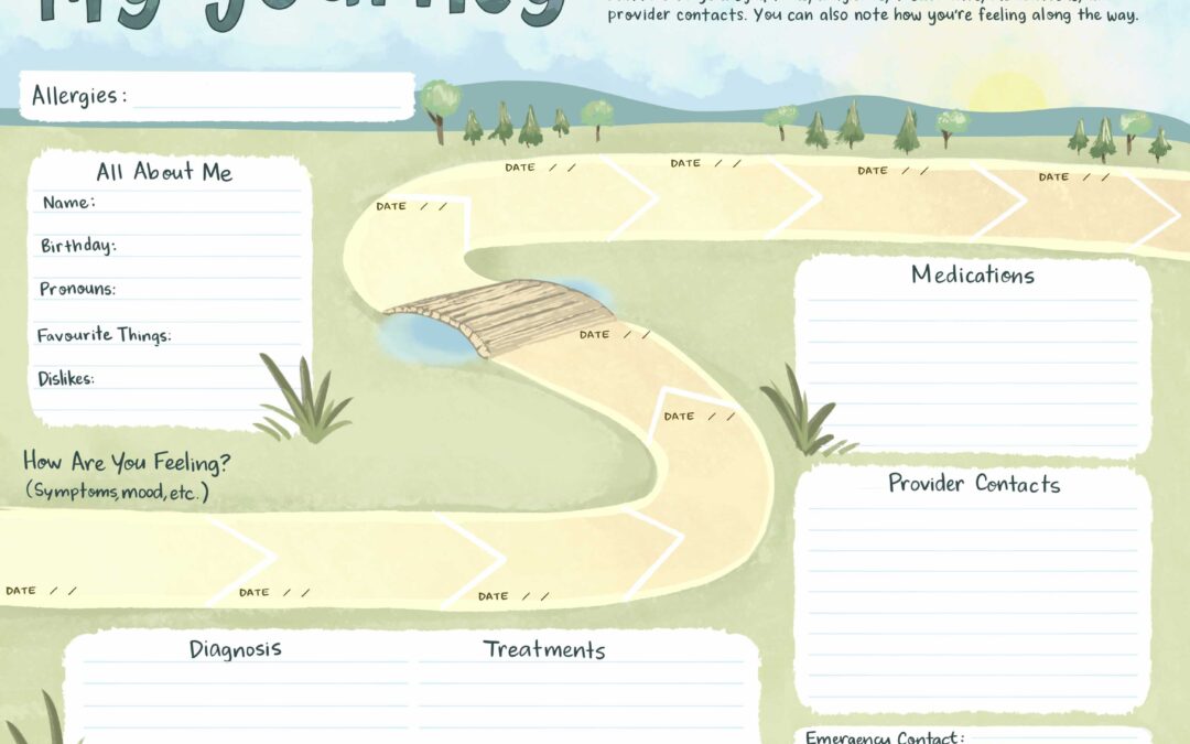
Many people assume that graphic recorders are artists who create beautiful murals. Some of us are, and our style of graphic recording reflects that. But many business and government clients are looking for a balance between visuals and content.
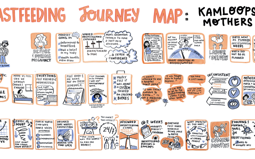
Having too many artistic visuals in a graphic recording can leave out the “meat” of the discussion and be off-putting to people who are more “left-brained” and looking for content. Likewise, a wall of text is overwhelming and not engaging — our minds don’t process it as quickly as visuals.
For example, infographics lay out information visually so that it’s easy to interpret and engaging. Graphic recordings are essentially life-sized infographics created in real time. It’s crucial to find the balance between visuals and content while making smart choices about white space and layout. There’s no value if a graphic recording is cluttered and and you don’t know where to start reading. People to who weren’t at the meeting should be able to read and make sense of the charts.
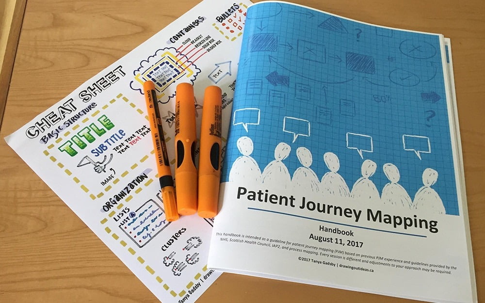
The same balance of visuals vs. content can be applied to presentations, Power Points, and reports. Even contracts and legal documents can benefit from visual elements… and it doesn’t have to be huge images or artwork — a subtle border, bold headings in a different hue, and a few appropriate images go a long way to keeping a reader’s eye moving.
Have you thought about the balance between visuals and content in your documents and presentations?
