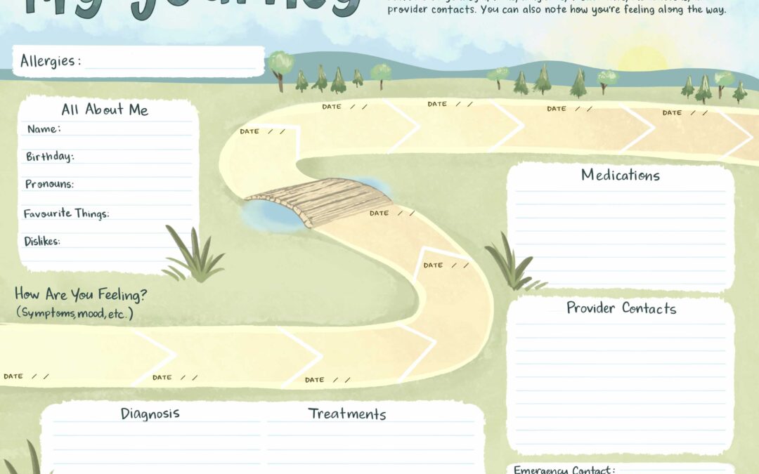
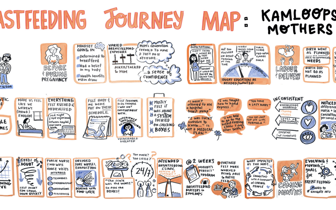
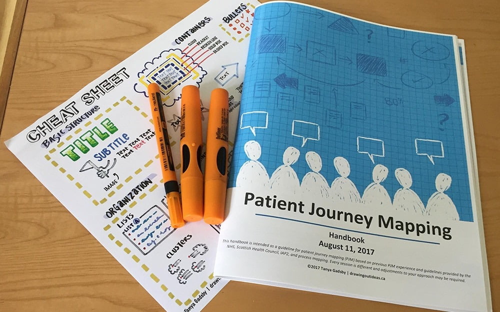
An infographic is a powerful way of communicating a large plan or detailed information; it’s not a replacement for a strategic plan, but a high-level visual tool to encourage people to dig deeper into the strategic plan document. Typically designed on computer, infographics can show the steps in a municipal application process, the journey of an organization over the years, or a corporate profile of a company… to name a few!
Versatility
Infographics are versatile; they present well on websites and social media, and can be printed to any size (especially if they’re produced on computer). You can include an infographic in a Prezi presentation, virtually walking viewers through the content. Or certain images or graphics from the infographic can be pulled out and included in other materials — icons for websites, brochures, or presentations.
Planning the layout
The most challenging part of an infographic is determining the best layout for the information, especially if the information is very complex. It’s important to pare down your content (without losing key information!), as an infographic should really capture the high-level perspective of an organization or journey. If the reader wants or needs more details, it’s a good idea to have a supporting document for the infographic.
Presenting Information
Another aspect to consider is the risk of skewing information. Presenting information visually is a powerful tool for communication; it’s very easy to display information so that it’s interpreted in a certain way. This is why it’s important for an infographic designer to always ask questions when working with a client — the client is the content expert and the designer should be sensitive to how the visual layout will impact the communication of that content. Collaborating together on each draft of the project is key — starting with a bare-bones skeleton of the layout, through to the final details of colourizing and publication.
Below are a few infographics I’ve designed — all with a different style and purpose!
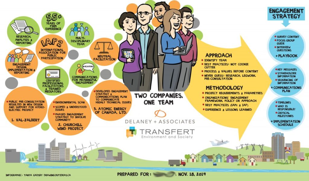
Corporate profile infographic
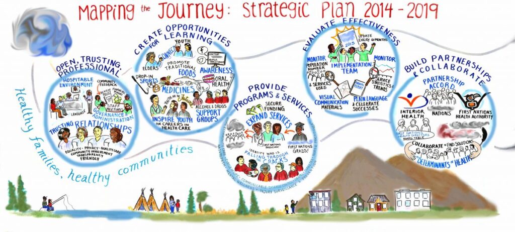
Strategic Plan Infographic – on 4′ x 8′ paper (confidential information removed)
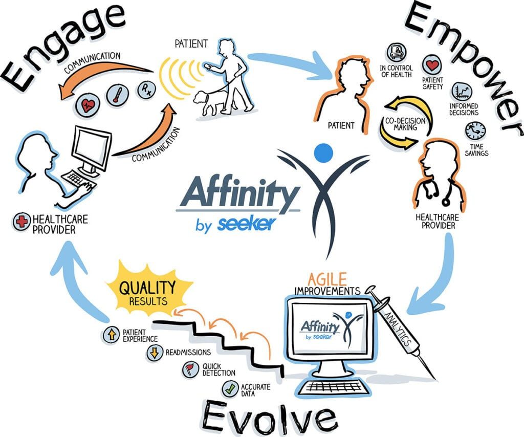
Simple, to-the-point overview of a program.
