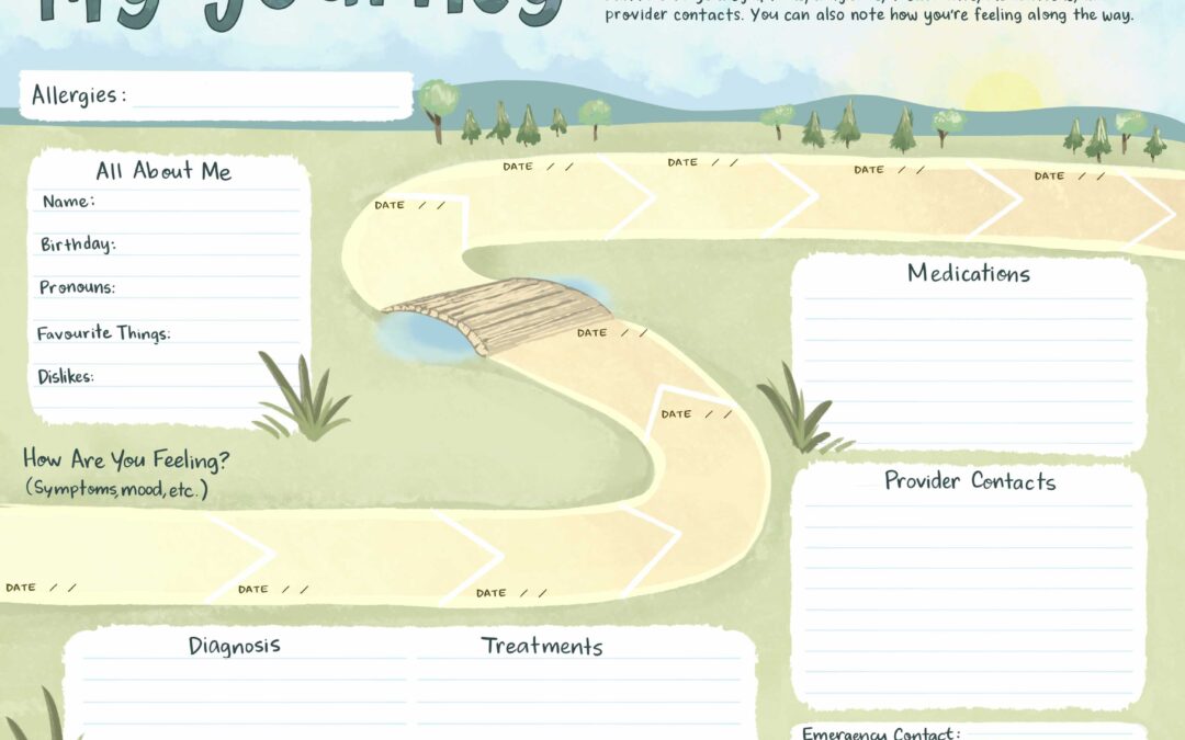
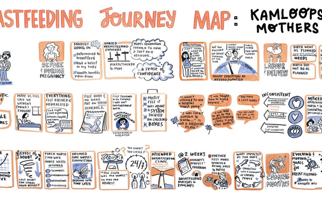
Styles of graphic recording vary between graphic recorders – some of us are highly visual, integrating lots of characters and images. Others are more text-based, utilizing structured bullet points, boxes, and fonts. And of course there is a spectrum of styles of graphic recording in between.
Likewise, every organization has a different “language” when it comes to articulating ideas, representing themselves, or understanding a concept. A financial investment firm talks about concepts and ideas differently compared to a community arts non-profit.
It’s crucial that an organization finds the right match when sourcing a graphic recorder or graphic facilitator for an upcoming meeting. There are many aspects to consider, such as professionalism, style of facilitation, previous experience, to name just a few. But you might also consider the visual language of the graphic recorder.
Styles of Graphic Recording
We’ve found our clients are served best when we take the time to understand a company’s culture of communication and align our graphic recording style to match. For example, we recently graphic recorded for Vanderbilt University at a professional roundtable for physicians across the United States. In the months leading up to the session, we asked the client a few questions to get a sense of their preferred visual style:
1. What was their previous experience with graphic recorders? What worked / didn’t work so well?
2. How do they plan to use the graphics after the event? Will they email participants the digital graphics? Or will the graphics also be used in reports, printed materials, or presentations?
3. Can you share any communication materials and/or Power Points with us so we can get a sense of your style of communication?
4. In the examples below, what style feels the best suited to your organization and how you talk about ideas or represent yourselves? (Text-based graphic recording vs. Visual graphic recording)
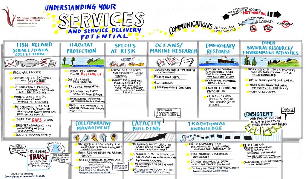
Text-based graphic recordings
These have fewer images, and are typically more structured / organized. Images are less playful, with a few exceptions.
Example of a text and bullet point graphic recording, organized under image headings.
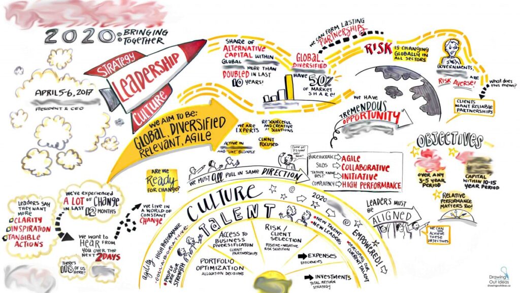
(confidential information blurred)
Example of a blend of text, arrows/lines, and a few key images.
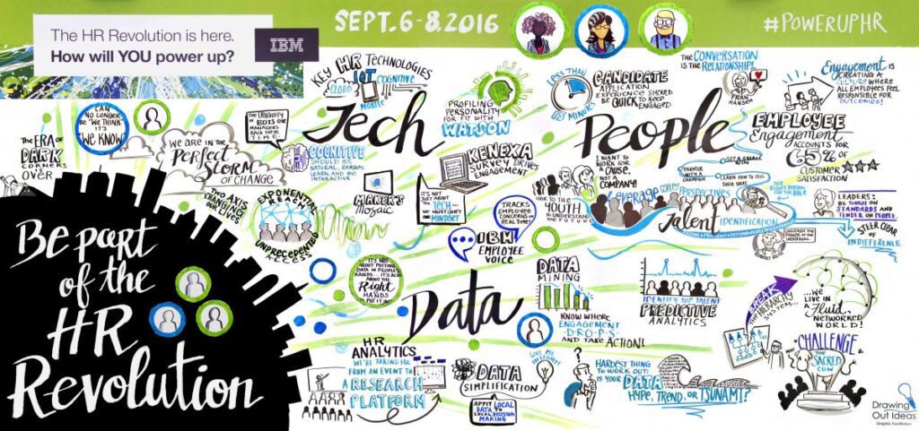
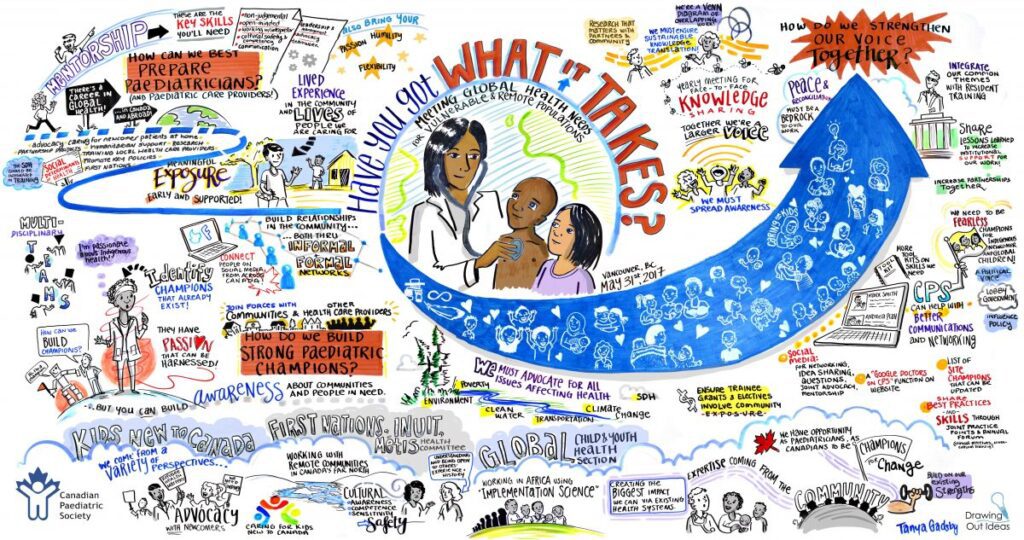
Visual graphic recordings
This style of graphic recording utilizes highly visual layouts, playful humour, and lots of colours. It’s effective at grabbing people’s attention at large events.
Character Style
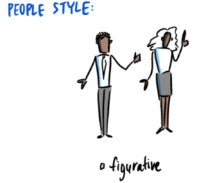
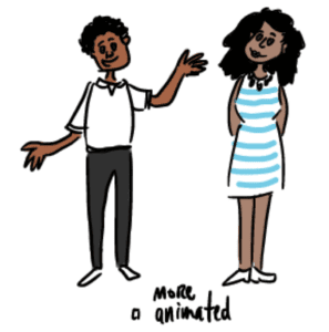
We also had the client identify what style of characters they felt best suited their communication style. Below are just two examples.
The client preferred a clean style of graphic recording, figurative characters, with icons wherever possible that could be isolated for use in other materials. They also told us that previous graphic recorders had chosen metaphors or images that were cliched and unrelated to their industry, which didn’t resonate with people in the meeting.
Knowing all of this ahead of time, we went in with a clear style plan for the graphics. And the response was overwhelmingly positive – participants at the conference were fully engaged in the graphic recordings, taking photos not only of the full sized graphic recordings, but also getting up close to snap shots of the icons we’d integrated throughout.
Below is an excerpt from one of four graphic recordings from the conference at Vanderbilt University. We have blurred out confidential information, but it’s an example of a more structured graphic recording. The goal was to keep the text well organized, integrate icons, and maintain a tidy layout.
Avoiding Clichés
Visual language also includes being aware of what is considered cliché for the group. For example, at a cancer research conference, we asked the client ahead of time what images we should avoid or are considered cliché in their field of work. The client told us that microscopes were overused as a symbol for research and that research encompasses much more than a microscope. Together we brainstormed other metaphors that would work better!
Cultural Sensitivity
Much of our work with First Nations communities requires cultural sensitivity and an invitation to the participants in the room to share what should be added to the graphics, removed, or edited. We steer away from using cultural images (feathers, medicine wheels, totems, long houses, etc.) unless these specifically come up in conversation in the meeting, or participants request them.
It’s About Authenticity
Every organization has their own “visual language.” Aligning the style of graphic recording to an organization’s culture of communication makes a tremendous difference in participants connecting to the graphics and feeling they’re authentic to the discussion. The graphics are also more likely to be utilized after the meeting in reports, presentations, or to engage employees who weren’t in attendance. The graphic recordings “living on” beyond the meeting is always the key to long-term value — customizing the style of graphic recording goes a long way in achieving this!
