The most asked question we hear from clients at the beginning of an infographic project is “how do I organize my content?” The clearer your content is, the stronger your infographic will be. This also saves significant time in drafts and revisions.
What is an infographic? “Infographic” is the umbrella term for a one-page visual showing data, facts, ideas, or themes. Some infographics are data-rich with graphs, charts, and diagrams. Others are story-rich and summarize themes and ideas from a project or meeting (these story-based graphics are also called “rich pictures,” “story maps,” or “visual summaries”).
Step 1: get clear on the audience & purpose
Always have your audience in mind when choosing a focus for the infographic. Who are you speaking to? What style of graphics (hand drawn? flat-style graphics?), layouts, and content will resonate with them? Is an infographic the right way to engage them?
Have a clear focus for the infographic — don’t try to fit everything onto one page. For example, maybe you want to inform the reader about actions your organization is taking over the next year. You wouldn’t also try to fit in details about how your organization is structured, or bios for your board members — those could each be separate infographics.
Once you’ve identified the purpose of your infographic, it can be helpful to chunk your messaging into three categories:
- What is critical for the reader to know?
- What is helpful for the reader to know (but not critical)?
- What is “nice to know” but could be shared on a website or in a report?
Step 2: edit your content
Once you’ve got a focus for the infographic and have prioritized your messages, edit your content so it’s around 150-300 words maximum, or even less! (If you can’t get it down to 150-300 words, we can help you edit!). Remember that an infographic is intended to be a visual executive summary. You want to pique people’s interest and give them resources to explore further (reports, websites, etc).
Before starting to design the infographic, ensure your content is as close to final as possible. The first step in designing an infographic is looking at the full scope of your content and laying it out in a way that flows well. Adding content after starting the layout and design will likely result in significant re-work because every piece of content should fit seamlessly with the rest.
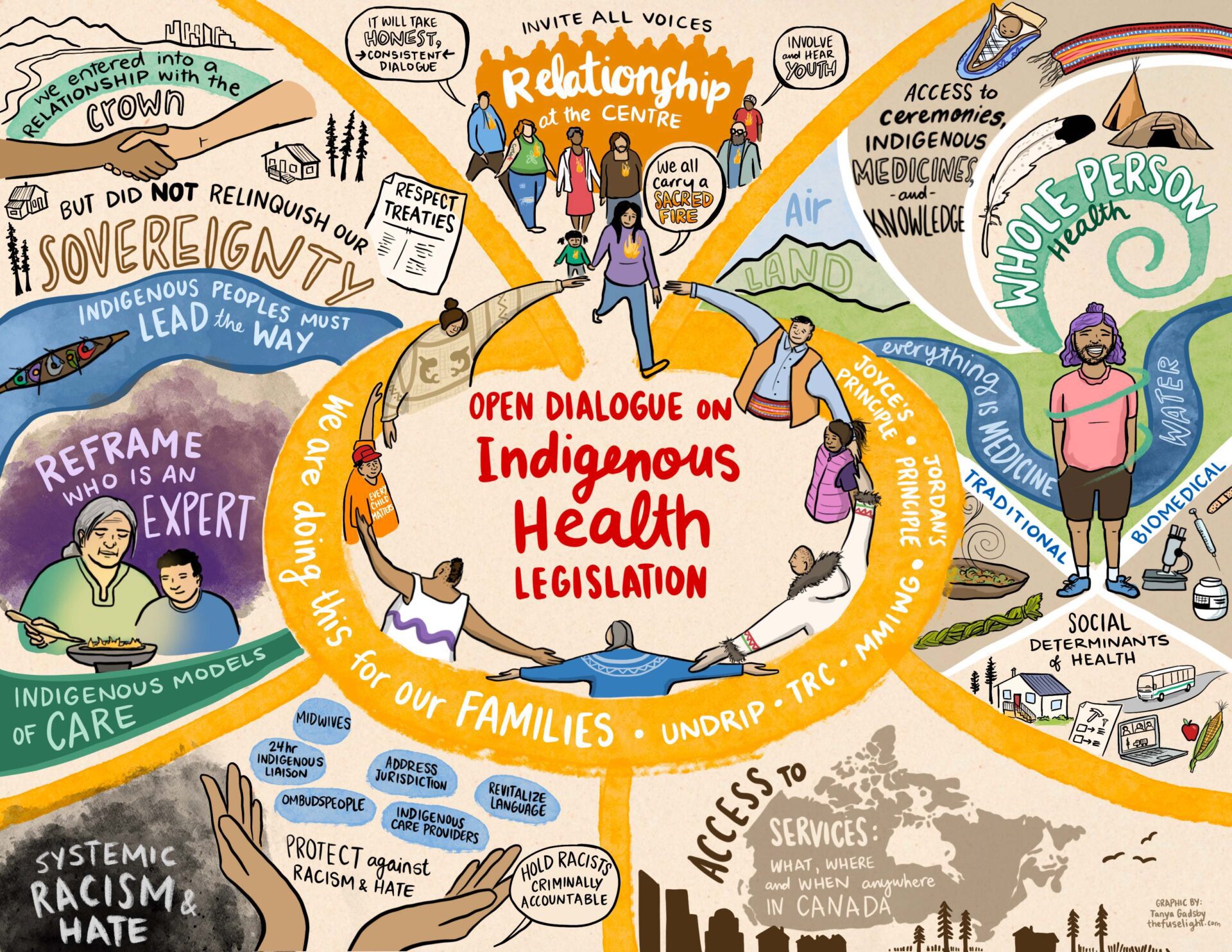
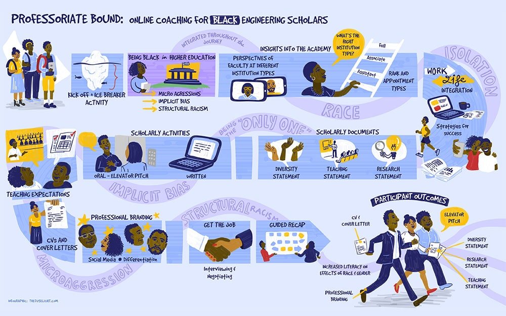
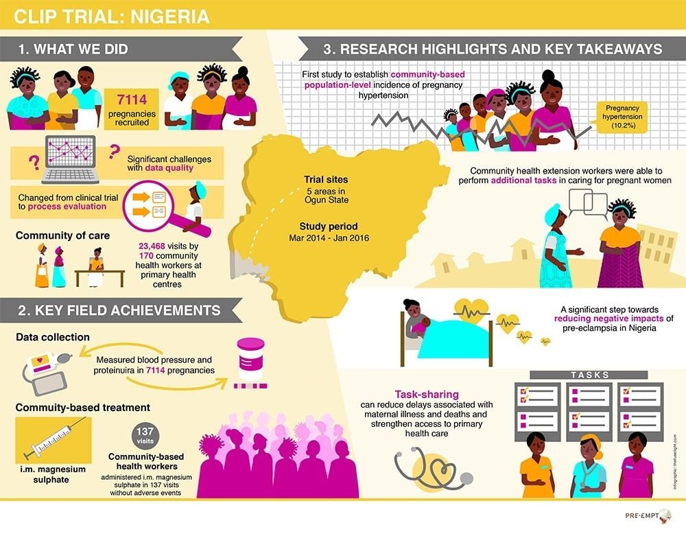
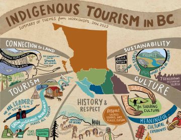
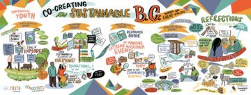
These infographics average between 120 – 150 words:
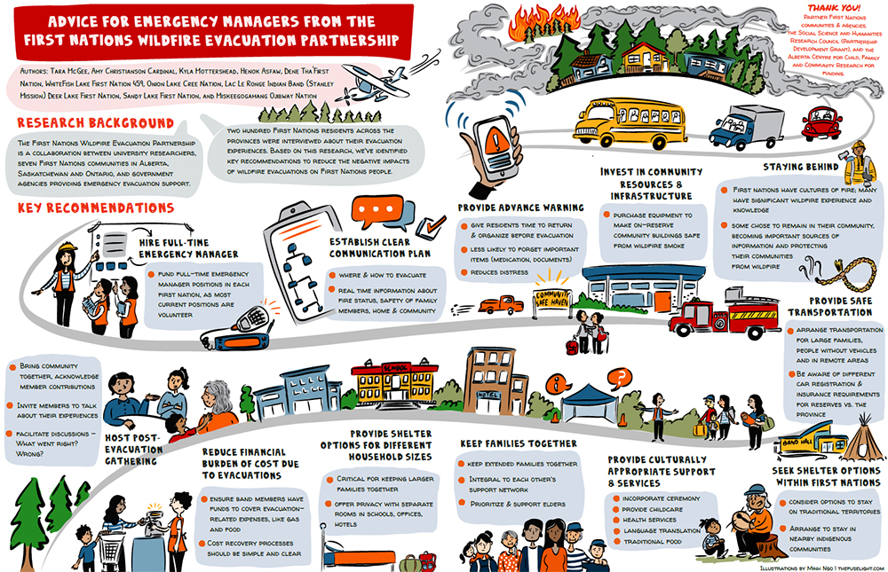
And this is an example of an infographic with a lot of content — approximately 430 words. You can see how it becomes difficult to lay out the content in a visual way, other than bullet points and text boxes.
Too many words? Consider clickable “pop ups!”
If it’s just not possible to whittle down your content, consider a clickable infographic with pop-ups showing more content, or linking to websites or videos. Interactive infographics offer versatility: the static version is a high-level summary, and the interactive version allows the reader to explore and learn more:
Click the image to view the interactive version
click image to view interactive version
Step 3: organize into main headings
Review your content and identify 3-5 main headings. These are the big themes we want the reader to see “at-a-glance.” Ensure your main headings are organized in the order of how you want them to appear on the infographic (e.g. Western audiences tend to read left to right, or top of the page down)
Having more than 3-5 headings is possible, but it’s best practice to keep to 3-5 headings to ensure your infographic is concise and engaging.
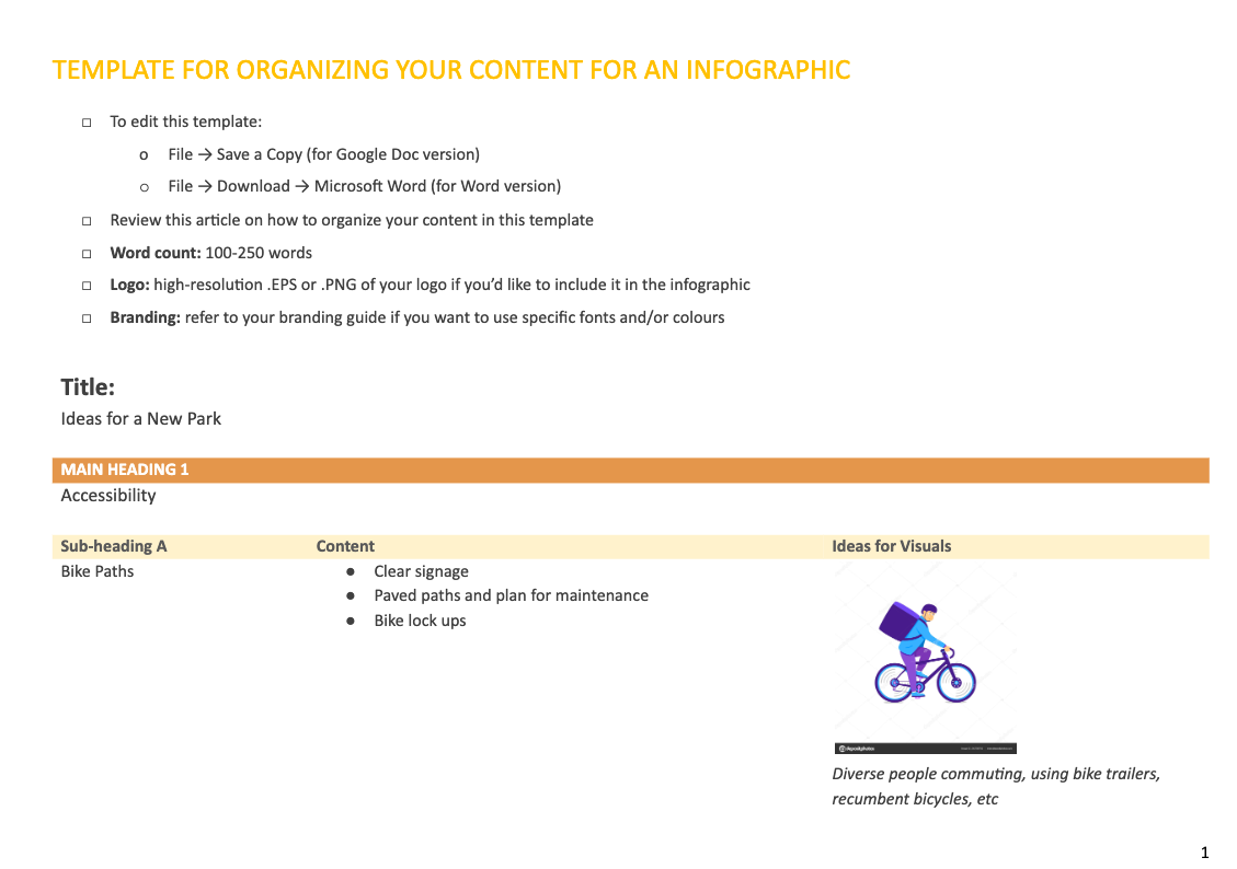
For example, let’s say we’re designing an infographic on “Ideas for a New Park.” Some of our main headings might be: accessibility, environment management, recreation, and pets in the park.
Step 4: sub-headings
Each of your main headings will have supporting ideas. Review this content and identify sub-headings within it.
Using our park example, sub headings for each main heading might look like this:
Main Heading: Accessibility
Sub Headings:
- Bike paths
- Wheel chair accessible
- Parking
- Walkability
Main Heading: Environment Management
Sub Headings:
- Stewardship & education
- Invasive species
- Native species planting
Step 5: detailed content & ideas for visuals
Each of your sub-headings may have content explaining findings, ideas, questions. Review this content and make choices on what is most important to include versus things that could be mentioned in one or two words (remember, readers can check out more detail in your report or website).
Not everything needs to be conveyed through text. Infographics convey feelings, concepts, and themes visually. When looking at your content, start noting visuals that might work well. (If you can’t think of ideas for visuals, that’s ok! When you’re working with an infographic designer, it’s their job to design visuals to match your content)
Using our park example, maybe bike paths has three ideas: clear signage, paved paths, and bike lock ups. But we also want to show accessibility for diverse cycling, such as recumbent bicycles, bike trailers, and kids bikes. These concepts don’t have to be listed in the infographic, they can be shown through visuals.
Main Heading: Accessibility
Sub Heading: Bike paths
Detailed Content:
-
- Signage with clear directions
- Paved paths, and a plan for path maintenance
- Bike lock ups: secure and enough space for everyone
- Visuals: show diverse cycling modes (recumbent bicycles, bike trailers, kids bikes)
Identify “pop up” content
If you’re designing a clickable infographic, identify what content needs to be revealed in pop up bubbles. Using the example above, maybe the diverse cycling modes could be listed in a pop up bubble when the viewer clicks on an image of a cyclist.
Free Template to Organize Your Content
We’ve put together a simple template to help you organize your content into a clear hierarchy. Click here to download a Google doc / Word version!