There’s actually an award for the worst PowerPoint presentations.
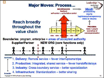
A top contender.
Many of us have sat through presentations that couldn’t hold the attention span of a five-year-old. Does creating an engaging PowerPoint take more effort? If you’re new to this, probably. Is it worth it? Well, considering you’ve spent time compiling information into a presentation, you probably don’t want people tuning out.
So what are some key components of a good PowerPoint?
Slides Are Billboards
Billboards are designed to convey an idea or message quickly. You wouldn’t see a restaurant billboard with long-winded bullet points about why you should eat there.
PowerPoint slides should support to your presentation. Use the slides as a backdrop to what you’re saying – they should enhance your speaking points. If you have a slide with a chart or data, make sure it’s clean and uncluttered. Your personal interaction with the audience is the most important part of the presentation.
Big Images
Instead of using small images, fill the entire slide space with an image (make sure it’s high-resolution to avoid pixilation). A strong image can serve as a backdrop for a title or line of text, or it can stand on its own.
Don’t use images or graphics to make your presentation look pretty. The images and graphics must enhance your presentation and help the audience understand your concept.
Minimal Text
Images and graphics trump text – we are visual creatures. Our memories are based on images. Trim your text back to a main title or a few key points on each slide and try to avoid lists and bullet points at all costs. The slides should be anchors for each topic in your presentation. It’s alright to have a few slides with more information, but keep it to a minimum and people will stay engaged.
Animated Graphics
An under-utilized aspect of PowerPoint is the ability to animate graphics. This is especially powerful when you want your audience to quickly grasp a complicated concept. I really encourage people to check out this fantastic example, courtesy of Tom Kuhlmann, a PowerPoint expert.
Put in the Effort!
People roll their eyes at the mention of PowerPoint, and indeed it has earned this reputation from countless poor PowerPoint presentations. But if you put in the effort to follow some of the steps above, you’ll avoid boring your audience. Best of all, you won’t win the award for worst PowerPoint in the world.
This post was originally written for Rethink Urban — a collaboration of people looking at best practices for great cities through engagement, place and spaces, and creative change.


