Just as our choice of words conveys meaning, so does our choice of visuals. The style of illustration used in graphic recording can be adapted to the tone of your gathering, the audience, and the content we’re capturing.
When we talk about choosing a graphic recording style, we are looking at the artistic lens used to interpret what we capture live in the meeting.
→ Visual Language & Metaphor: Are we drawing rich, story-driven scenes with deep human emotion? Or using polished icons focused on systems and data?
→ Structure: Is the canvas organized as an organic, flowing narrative? Or chunked into crisp, organized sections?
→ Linework & Finish: Do we use rapid, energetic linework that feels in-the-moment? Or flat, polished illustrations reminiscent of modern editorial illustration?
We also separate Style from how we apply colour or choose the format:
→ Illustration Style = How we draw (the visual language, linework, and artistic depth)
→ Colour = How we use palette (full colour, limited palette, or black & white — available across all styles)
→ Format = Where we draw (white paper, warm brown paper, black paper, foam board, or digital screen)
Ahead of an event, we have a call with the client to review how best to integrate graphic recording with the gathering, including which style is best. It’s not about what style the client (or their manager!) likes the most. The right style always balances three things:
→ Tone: The energy and feeling you want to cultivate in the room.
→ Audience: The visual language that will best engage the people present.
→ Content: The structure that makes the content easiest to digest and remember.
→ How you want to use the graphic recording after the event.
An overview of graphic recording styles
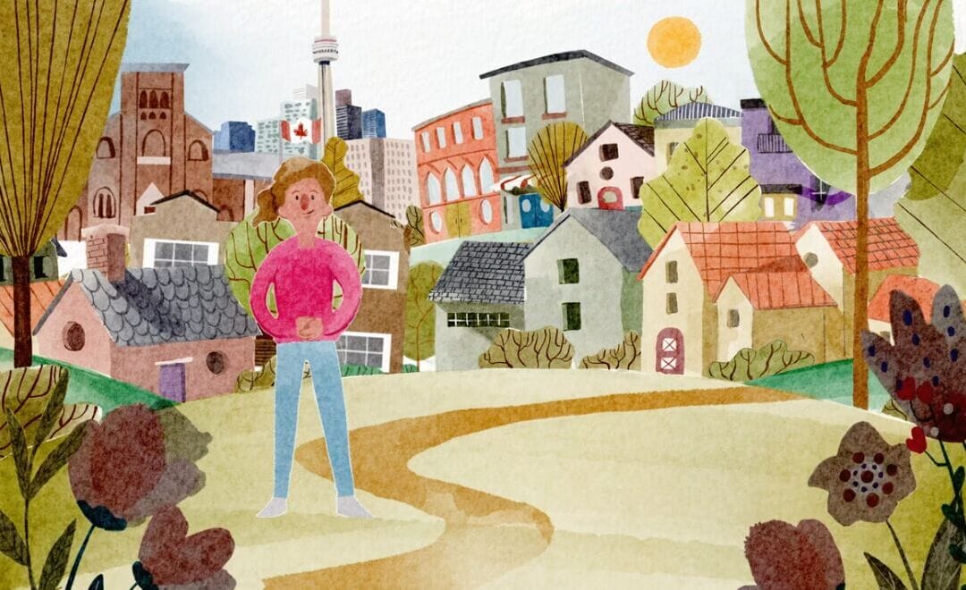
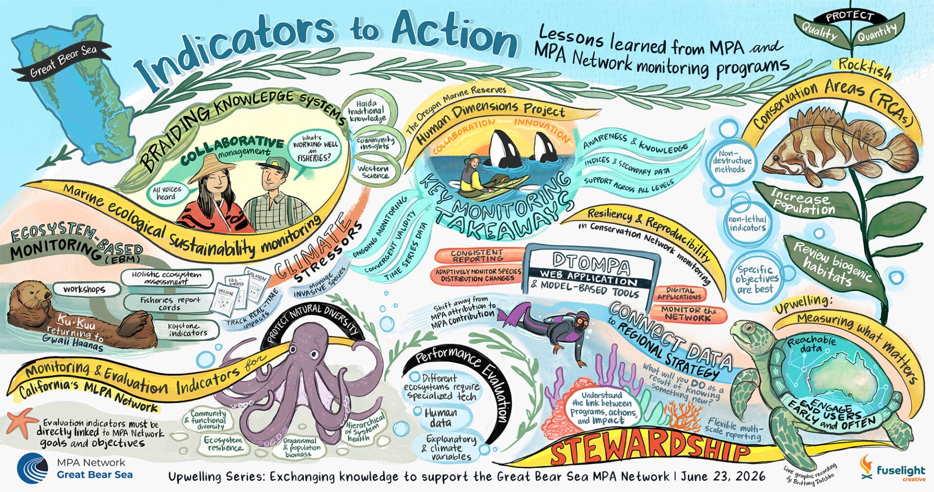
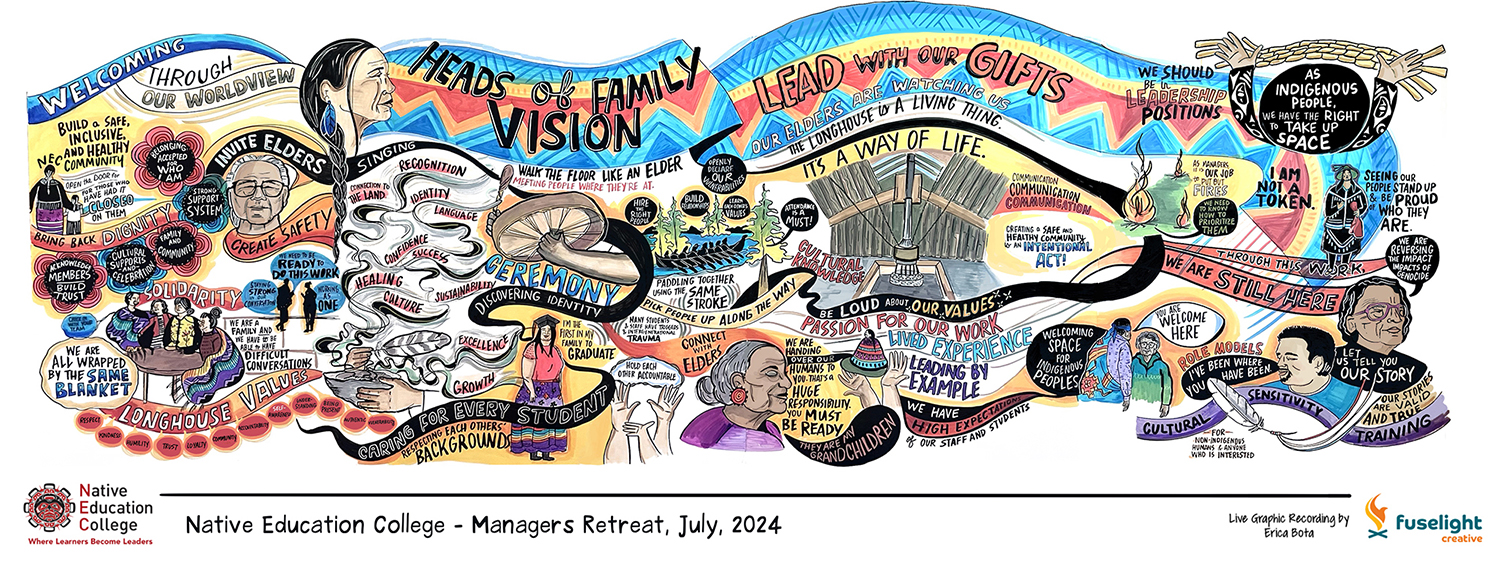
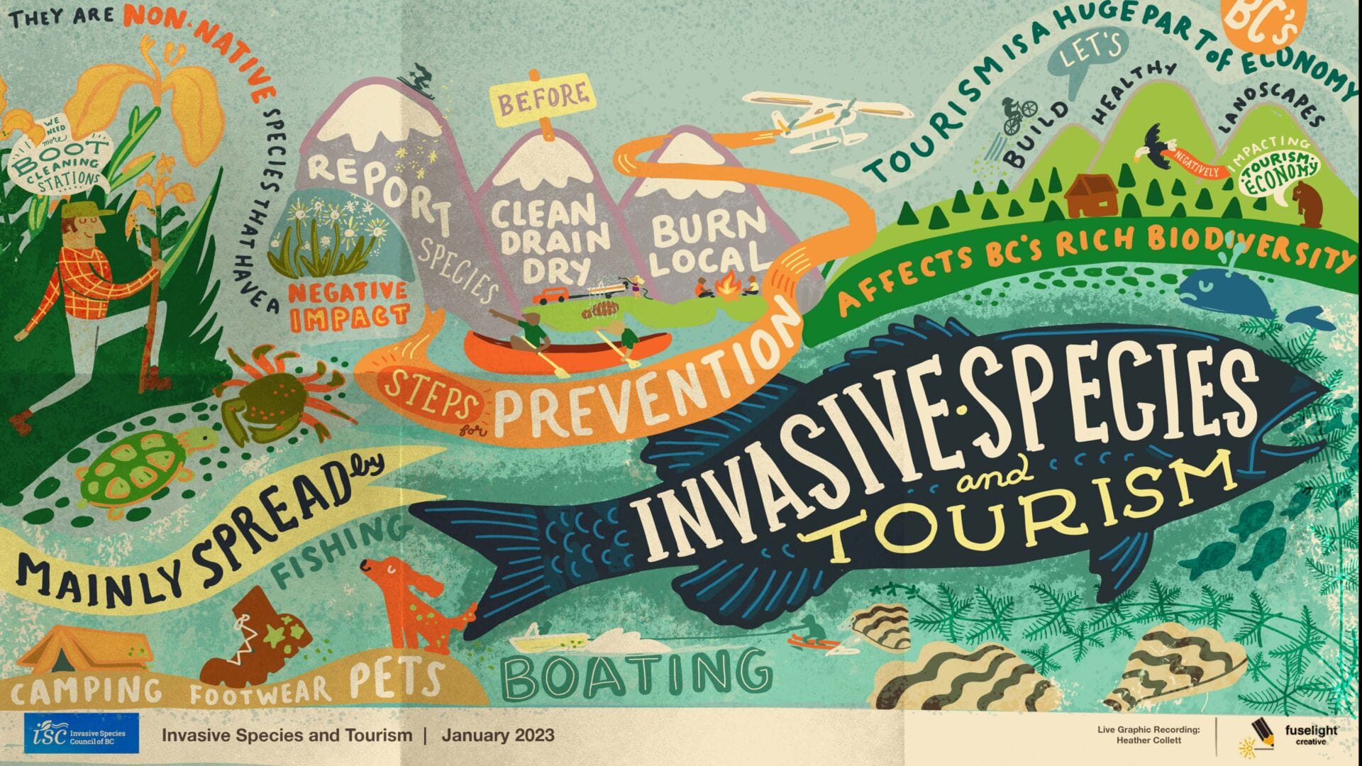
Richly Illustrative
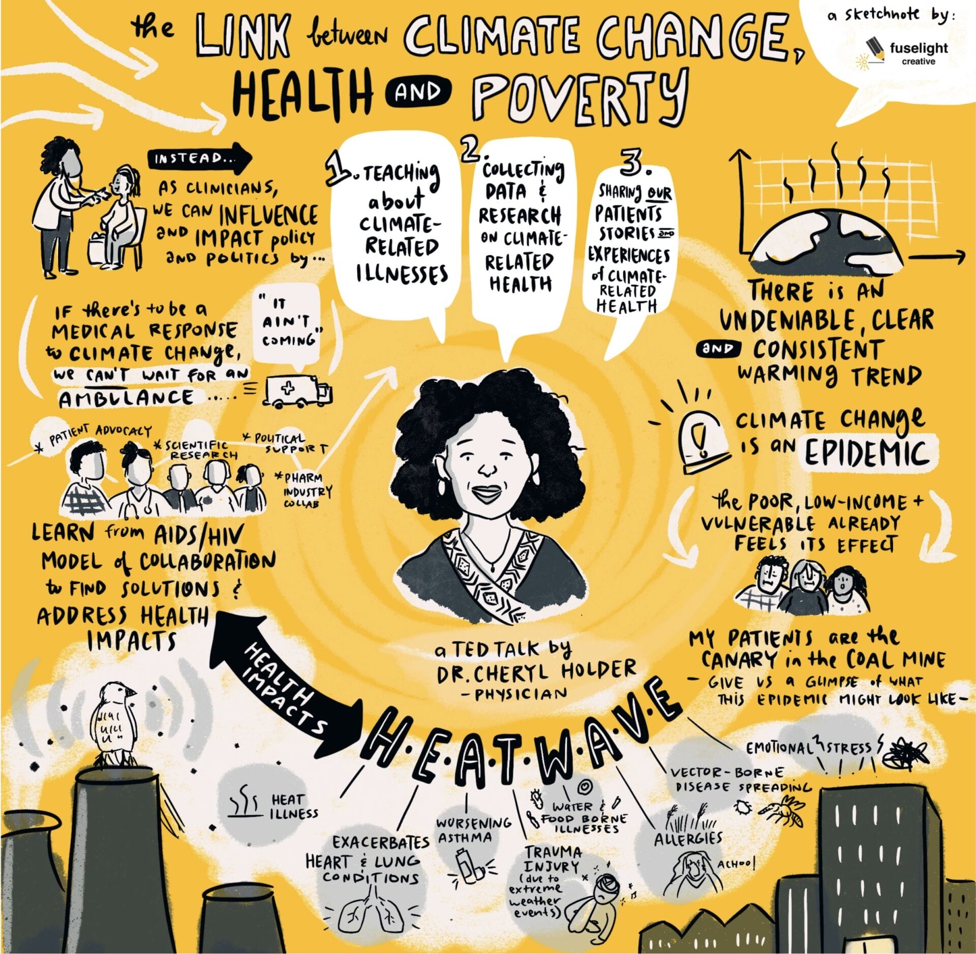
This style leans heavily into story & metaphor through richly illustrated scenes. Content flows organically between sections, text is written along curves or angles, and sometimes there are dense areas with lots of detail.
Great when you want to: Humanize a strategy, lean into storytelling and emotion, celebrate culture, build empathy, or centre lived experiences.
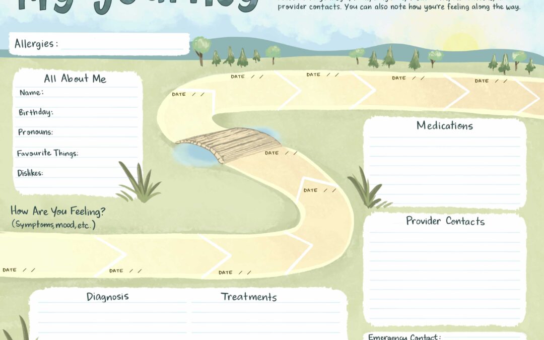
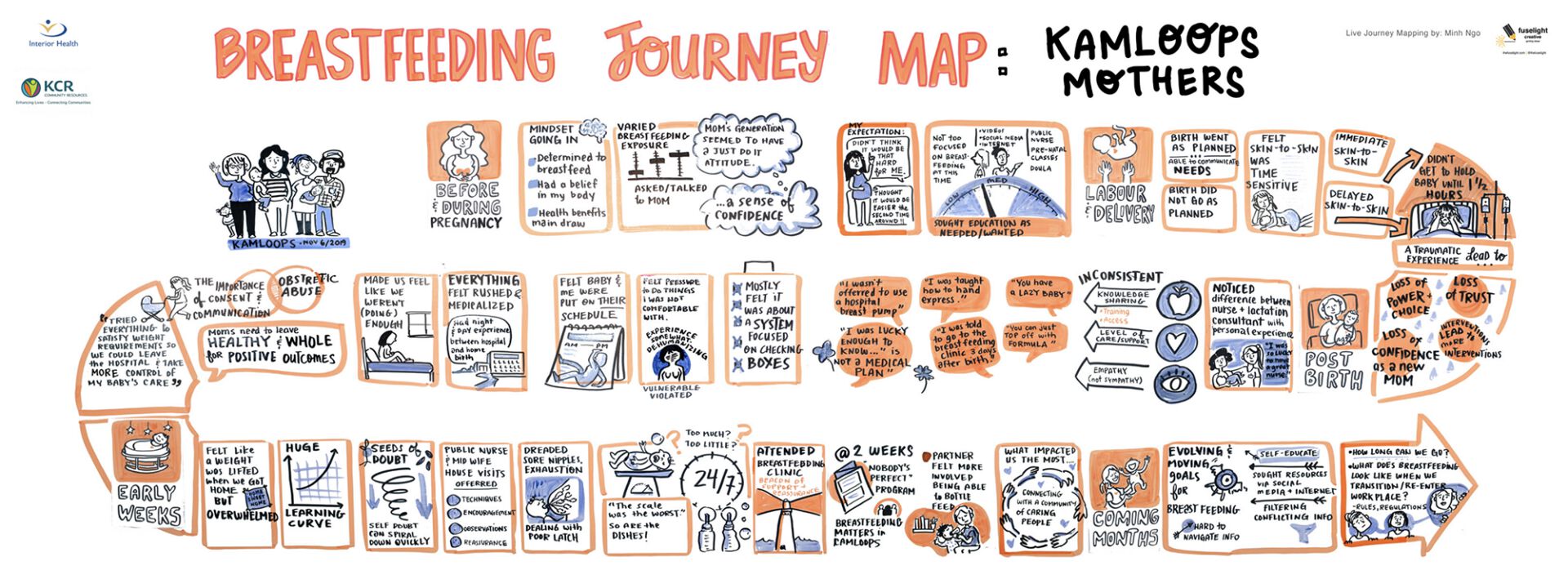
Structured & Organized
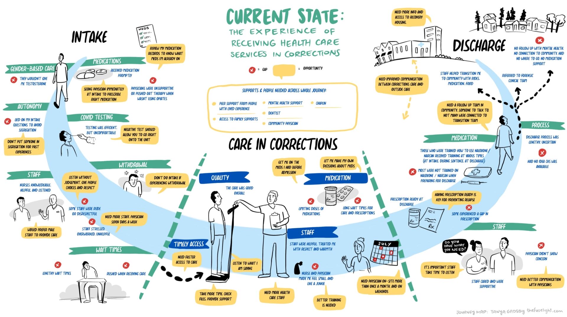
Uses structured layouts, clear sections, crisp iconography, and consistent text hierarchy. Often there is a stronger use of white space to allow the eye to breathe when there is more text content to take in.
Great when you want to: Map complex workflows, or turn detailed discussions into a scannable visual.
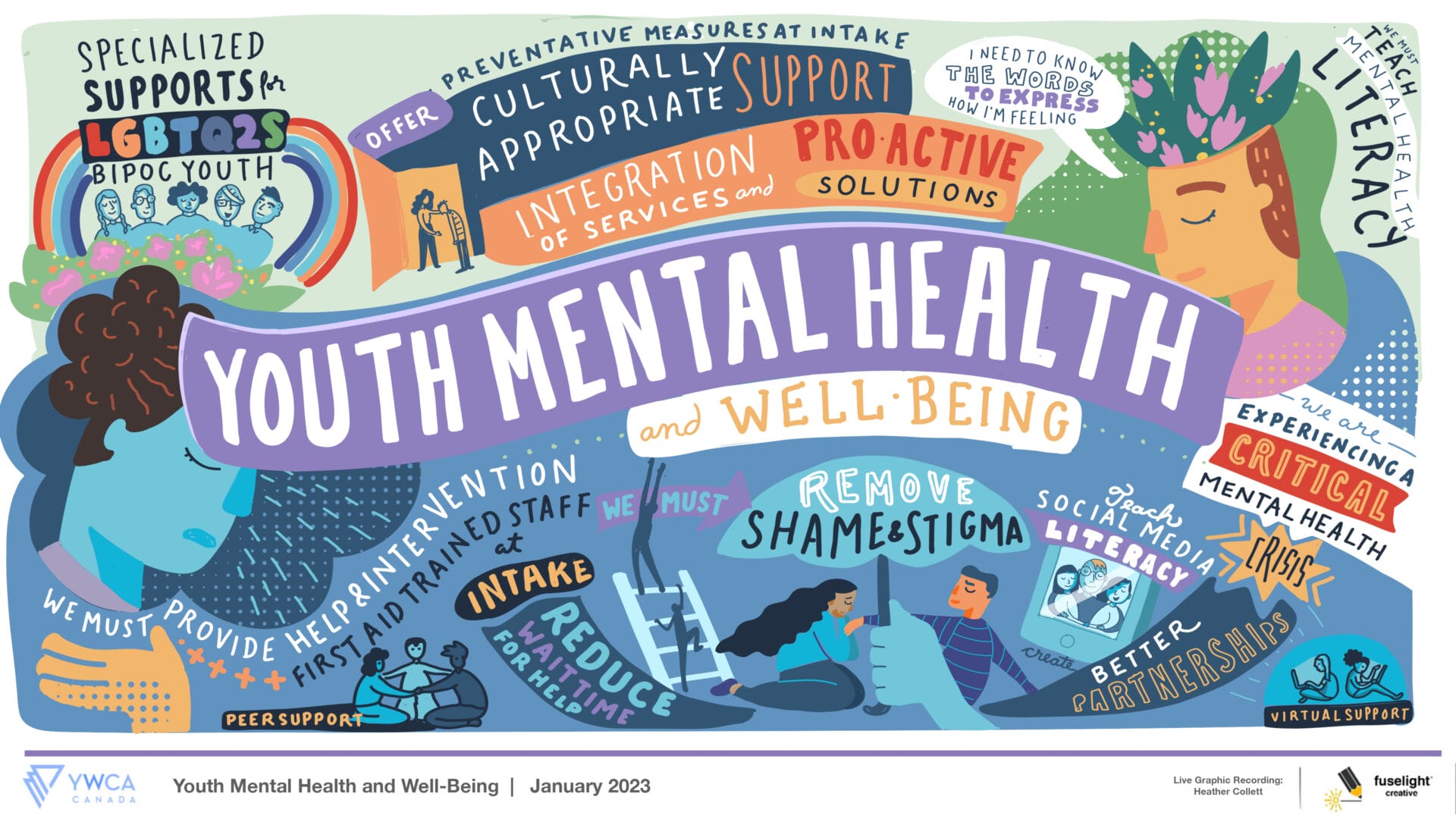
Editorial
This style shares similar traits as “Richly Illustrated,” however it uses vector-style graphics, textures, bold colour blocks, and editorial use of framing and white space. It feels like it could be a spread in a magazine or editorial article.
Great when you want to: Profile keynotes, create a publication-ready piece for reports, or command immediate visual attention.
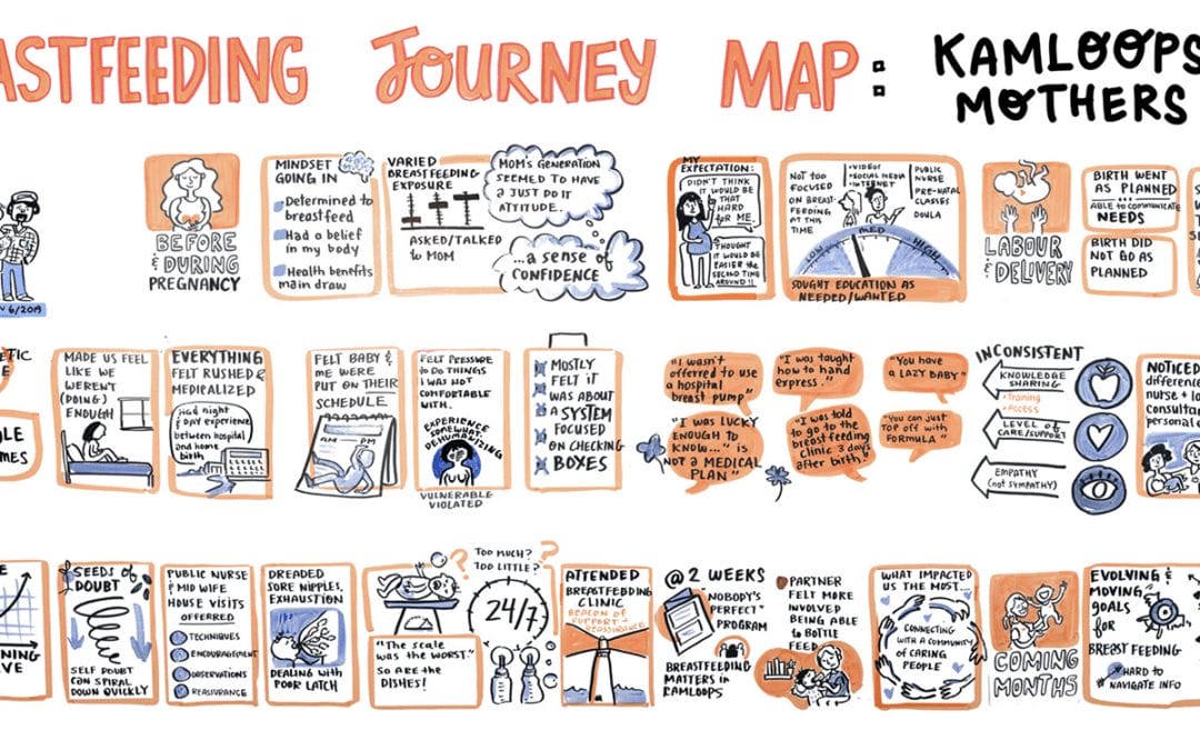
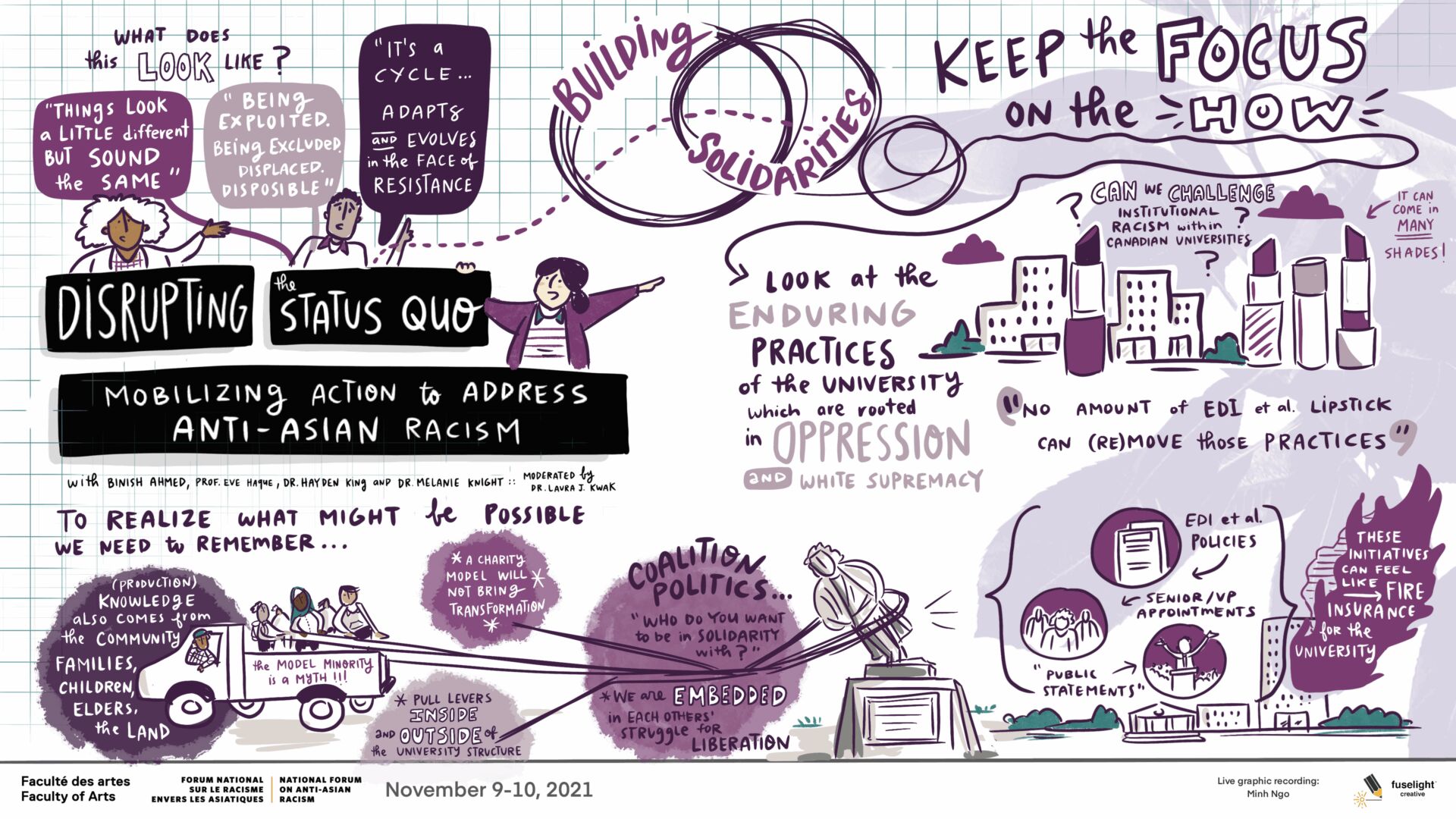
Loose Sketch Style
The loose line work and “imperfect” look conveys that ideas are in motion and evolving. This style feels like it was made right in the room as words were spoken.
Great when you want to: Signal to participants that plans are still evolving, lower the pressure in the room, and encourage raw, spontaneous feedback on the graphics.
Photograph / Mixed Media
Photographs, such as local landscapes, community territory, or a photo of speakers in the room is layered seamlessly with live digital graphic recording.
Great when you want to: ground abstract dialogue in tangible reality. Seeing familiar landscapes, real faces from the room, or actual project photos woven directly into the graphic creates immediate personal connection, emotional resonance, and a strong sense of place.
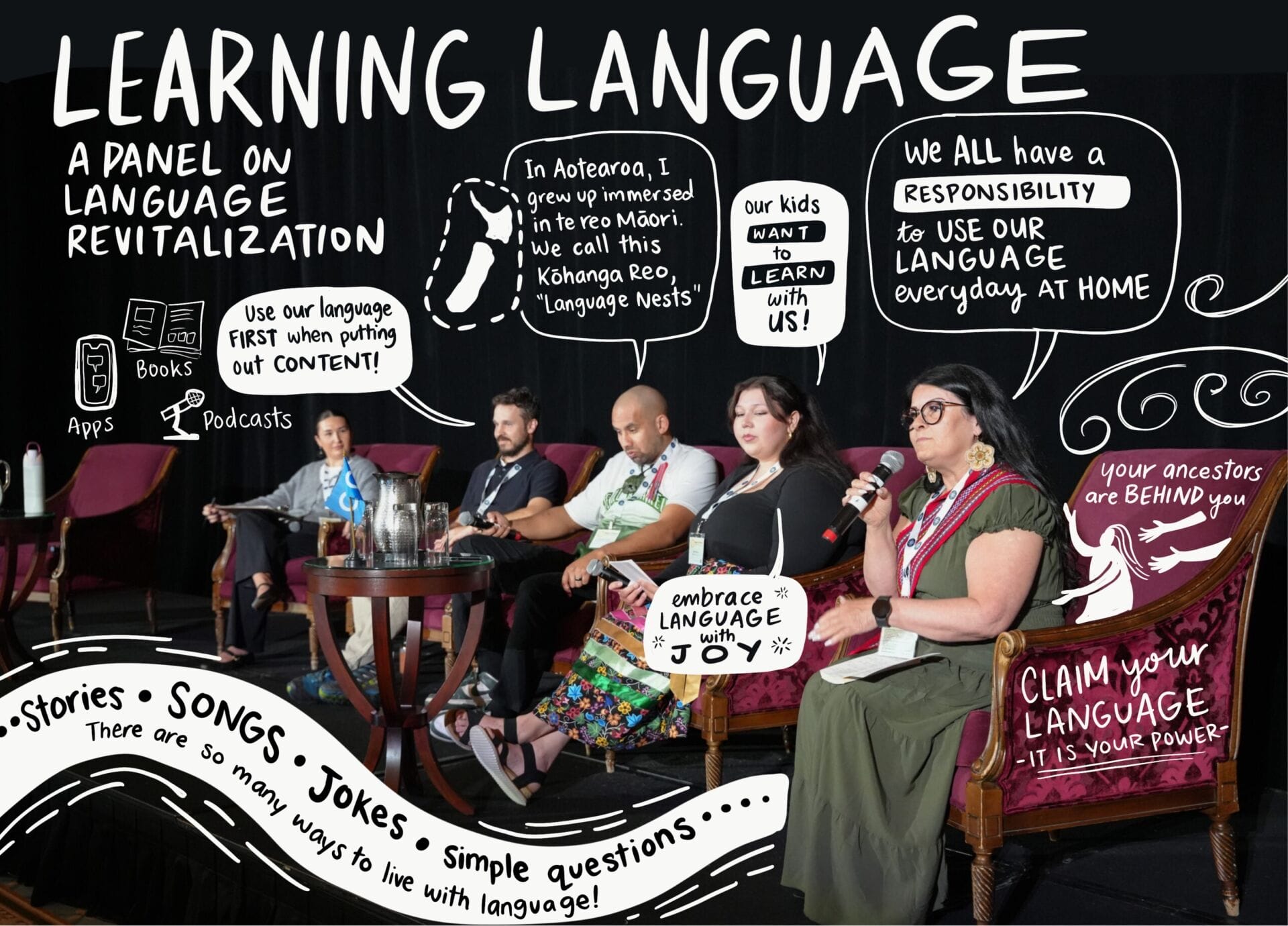
Photo credit: https://www.metisnation.ca/what-we-do/education-and-employment/
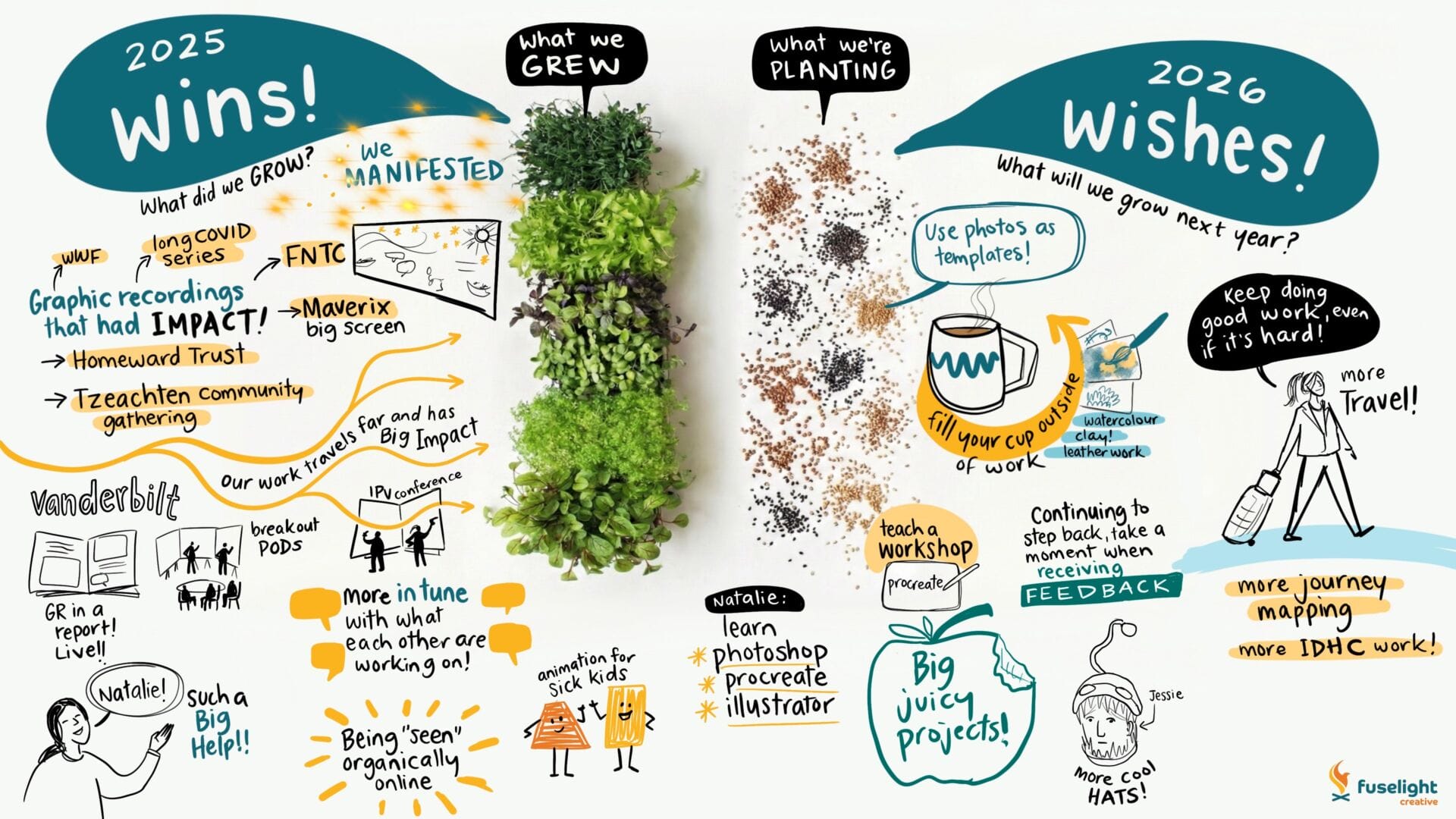
Graphic recording is a communication and engagement tool, and it needs to adapt to the meeting so it’s an authentic reflection of the conversation. By being thoughtful about what visual language we use, the graphics are more likely to fit seamlessly into your event and facilitate dialogue.